I had the opportunity to work with the lady boss of BatterProject for their logo and branding. I was so very keen cos i have not been doing logo and branding in a long time and i’ve been itching to do it again. The fact that i get to sample some of their bakes is a bonus as well. Ok I wont lie, my mind was more or less swayed because of that reason alone.
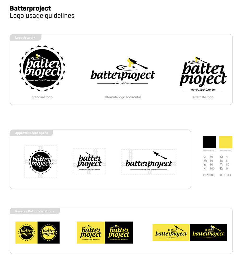
Here’s the condensed version of the logo branding guideline for you nerdy design guideline obsessed peeps. (i love these guideline thingies too! cant get enough of ’em)
Ask lots and lots of questions
After a quick meetup session, a few exchanged messages and a logo questionnaire later, i finally have a brief to work with. This would be one of the few projects where most of the brainstorming and developing process happened on the screen more than my sketch book. I did start a bit on my sketch book as seen here, which is very early in the branding stage that they have not settled for a name yet. But i knew the mood and feel they were after so i just proceeded to see if i can find a logo mark that would be good for the name to be associated with. As you can see, i went with the traditional whisk and laddle(which at this point just looks like an oversized spoon)
Your 1st drafts will always be bad..... always
These are the first design drafts with some variations at play, as per the initial brief. As much as id like to nail it first time everytime, that is rarely the case. Usually, i would still be churning out some sketch ideas with a pen on paper but as i’ve said earlier, i just took it straight into illustrator and ran with it.
Gets more focused and narrowed down as you go
With the feedback gathered from the first design drafts + another round of discussion, i went straight for the jugular and came up with this. The boss mentioned that they were not too keen on the choice of typeface, so it got changed as well. I took a risk and sent an almost finished and refined looking logo to them and fortunately for me, they loved it. The next step was to provide some orientation and also color variations to the chosen logo. I was also glad that they liked the accented yellow amongst the contrasty black and white. It adds that very small bit of color that just seems to work to brighten it up just a tiny bit.