


I was approached to help out with some identity branding guidelines, business stationeries and a website for an up and coming malay bridal wedding studio in Singapore calling themselves Sovereign Bridal. With a name like that, my work was really cut out for me and true enough, the initial brief that i received needed the logo to look grand, expensive, stylistic and of course simple to some degree.
I quickly booked an appointment with the ones in charge and tried to pick away at their brains. Trying to figure out and narrow down the look and feel that they were after. What i found out was that they have big plans for the local market. Apart from the usual make up services and bridal dress on offer, they also hope to set up a make up academy as well. And of course i would have to look into how to incorporate that into their logo as well.
I quickly booked an appointment with the ones in charge and tried to pick away at their brains. Trying to figure out and narrow down the look and feel that they were after. What i found out was that they have big plans for the local market. Apart from the usual make up services and bridal dress on offer, they also hope to set up a make up academy as well. And of course i would have to look into how to incorporate that into their logo as well.
I quickly booked an appointment with the ones in charge and tried to pick away at their brains. Trying to figure out and narrow down the look and feel that they were after. What i found out was that they have big plans for the local market. Apart from the usual make up services and bridal dress on offer, they also hope to set up a make up academy as well. And of course i would have to look into how to incorporate that into their logo as well.
I quickly booked an appointment with the ones in charge and tried to pick away at their brains. Trying to figure out and narrow down the look and feel that they were after. What i found out was that they have big plans for the local market. Apart from the usual make up services and bridal dress on offer, they also hope to set up a make up academy as well. And of course i would have to look into how to incorporate that into their logo as well.
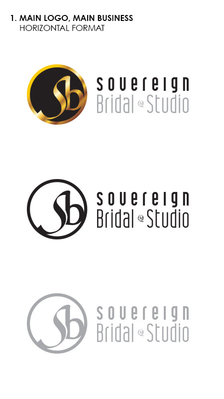
After a bit of a back and forth with the preliminary drafts, both sides honed in onto these and i had fun expanding the idea. The clients are keen on both the circular and squarish format much to my surprise. I would usually advise them to choose either one as it would confuse their potential clients, but to be honest i think both of them work just as well. With one being the main logomark, the other could be an alternative logomark to be used on collaterals where space might be a hindrance.
The main logomark would feature the company’s initials of an “S” and a “B” The typeface of choice should reflect simplicity with a touch of flair and elegance. Both of the typeface in the logomark and the logotype are different, but still has to complement each other well.
The alternative logo features just the logomark without the circular boundary. This gives the brand a little room to breathe. In places where a large enough space is available, this would be the preferred logo combination to use.
As far as logo projects go, this is one of those projects where alot of variations are needed. The company has mentioned of setting up a makeup academy of sorts where the would be providing makeup courses and manicure/pedicure services in house.